Sahiba Cuccria
8 mins read
2 mins read

Blink. Blink again. That’s how long you have to make an impression on a customer who visits your e-commerce website. This is the time to make a big splash. Go big or your customer will go somewhere else.
Whether you have or plan to create your own online shop or if you have decided to hand off the task to a web designer, your vision matters. So what are some elements that will make visitors go “yay”?
1. Don’t let them guess.
If your site does not clearly spell out who you are, what you do, and what customers can get out of the visit, they will be heading for a quick exit. Treat the homepage as if it were the front door of a brick-and-mortar shop. You hardly would expect anyone to open an unmarked entrance, right?
2. Know your audience.
Speak to your target audience in their language. If you sell high-end apparel to corporate honchos, you may not want to sound like a surfer dude or have a site that does not match the refined taste of your customers.
3. Think clean.
The best e-commerce sites tend to have an airy, clean feel. Resist the temptation to add a forest of tiny headers and pictures on the homepage. You don’t have to show off your whole repertoire right away. Clean up the clutter and send a clear message what your store is all about. Let one or two large images or product shots do the talking.
4. Focus on pics.
The importance of stellar photography keeps increasing. Compared to the text-heavy sites of the past, modern e-commerce sites typically rely on large background images and blended typography. But you obviously can’t throw any image into the mix. Poorly composed or grainy photos have no business being published. Quality counts. If you need stock photos, sites like Pixabay or Freepik offer high-resolution images and art illustrations for free. The quality of smartphone cameras has also improved to the point that they can now be used to capture product shots.
5. Make it easy.
Good graphics cannot replace ease of use. Design and usability must go hand in hand. If your customers can’t navigate your site, it’s more like a brochure than an online shop. It must include Calls to Action to help your customer reach “Purchase.” By including CTAs like “Learn more,” “Sign up,” and “Get Started,” you give customers a virtual key to dig into your site. The fewer clicks before they complete a purchase, the better.
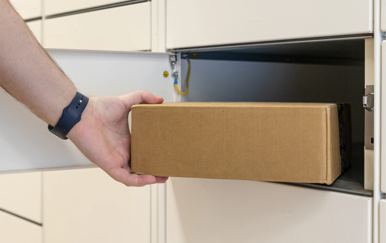
Once the product has been ordered, another important part begins: shipping. For the best carriers and most competitive rates, let eShipper help you. Click here to learn more about us or contact us for more information.